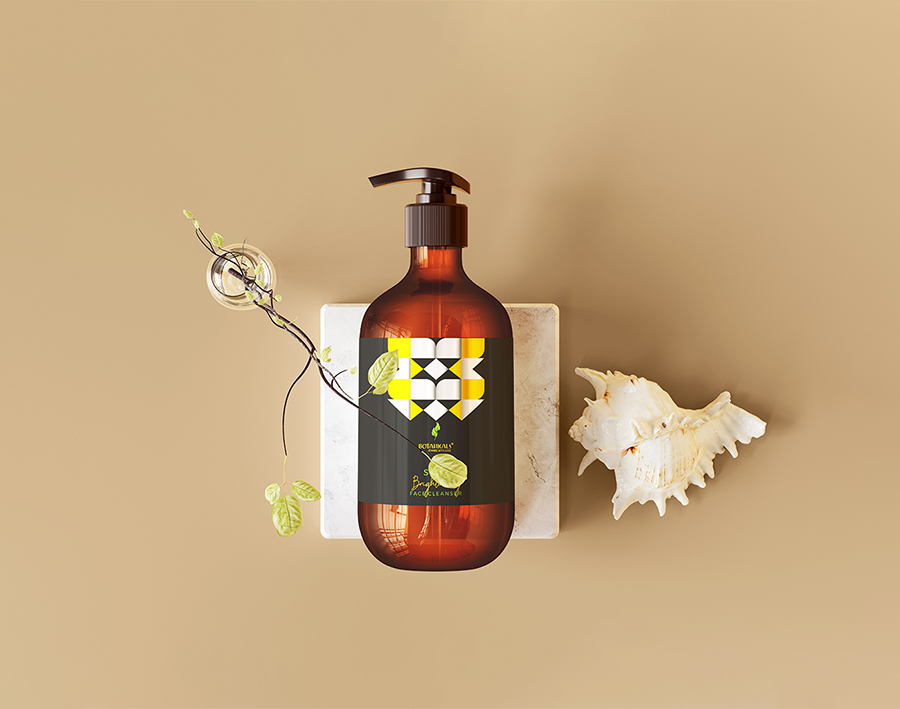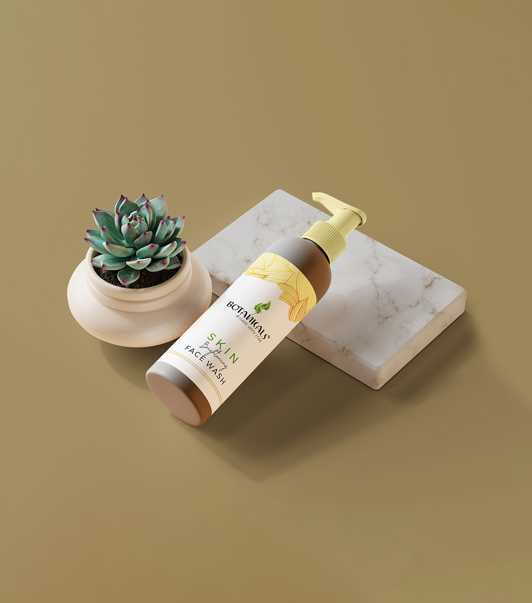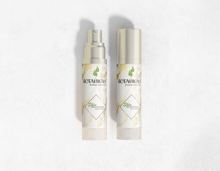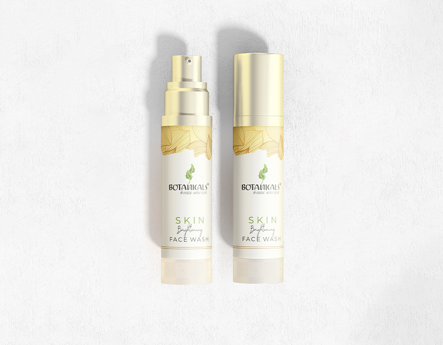


Revitalize Botnica's cosmetics line with a strategic redesign. Infusing elegance and functionality, we'll ensure the packaging aligns with brand identity and consumer preferences for a captivating shelf presence.
2018 - 2022 September
Botnica | Graphics Work

A Botnica cosmetics packaging redesign wireframe: Elevate shelf appeal with a prominent logo, visually striking front panel, key information section, brand tagline, detailed back panel, and cohesive brand colors.


Blue | Gray | Black | White
Iconify Flat Icon Set